One Room Challenge: Week 2 , The Consultation and Floor Plan
Welcome to Week 2 of the Fall, 2020 One Room Challenge This week we will sit down “virtually” with our clients David & Nicole Virtualson, at their home in New Jersey for what is the first step in our design process, The Consultation. Before we catch up with David & Nicole, if this is your first time checking out my blog.. welcome and be sure to hop back over to our Week 1 post to catch up!
THE CONSULTATION:
A few weeks back David & Nicole, went to our website and filled out a contact form. We had our initial 15 minute discovery call and afterwards the couple completed our client questionnaire and scheduled an in person consultation! So here we are… Today is consultation day and I am so excited to meet our prospective clients for the first time! To start the meeting, we take a tour of their space.
Generally speaking, during this portion of the meeting we will review your design needs and dreams in detail. This is usually when my curiosity peaks. I find that I not only ask things like, what are your favorite colors, but I dig deeper to understand why and may even ask to take a tour of your closet to see those colors for myself. As we tour your home, I’ll share design ideas and inspiration, assess the current conditions and project specifics including budget and timeline, take pictures and measurements, provide immediate design advice and more. Phew! That’s a lot to cover in a 1.5-hour meeting. But we’ve have done it over a hundred times here at Gray Space and now have it down to science, so that it is as efficient as possible. As the meeting wraps, we conclude with a great one-on-one conversation, where I share all the details of our design process, answer any questions you may have and learn more about you and your lifestyle.
THE ROOM:
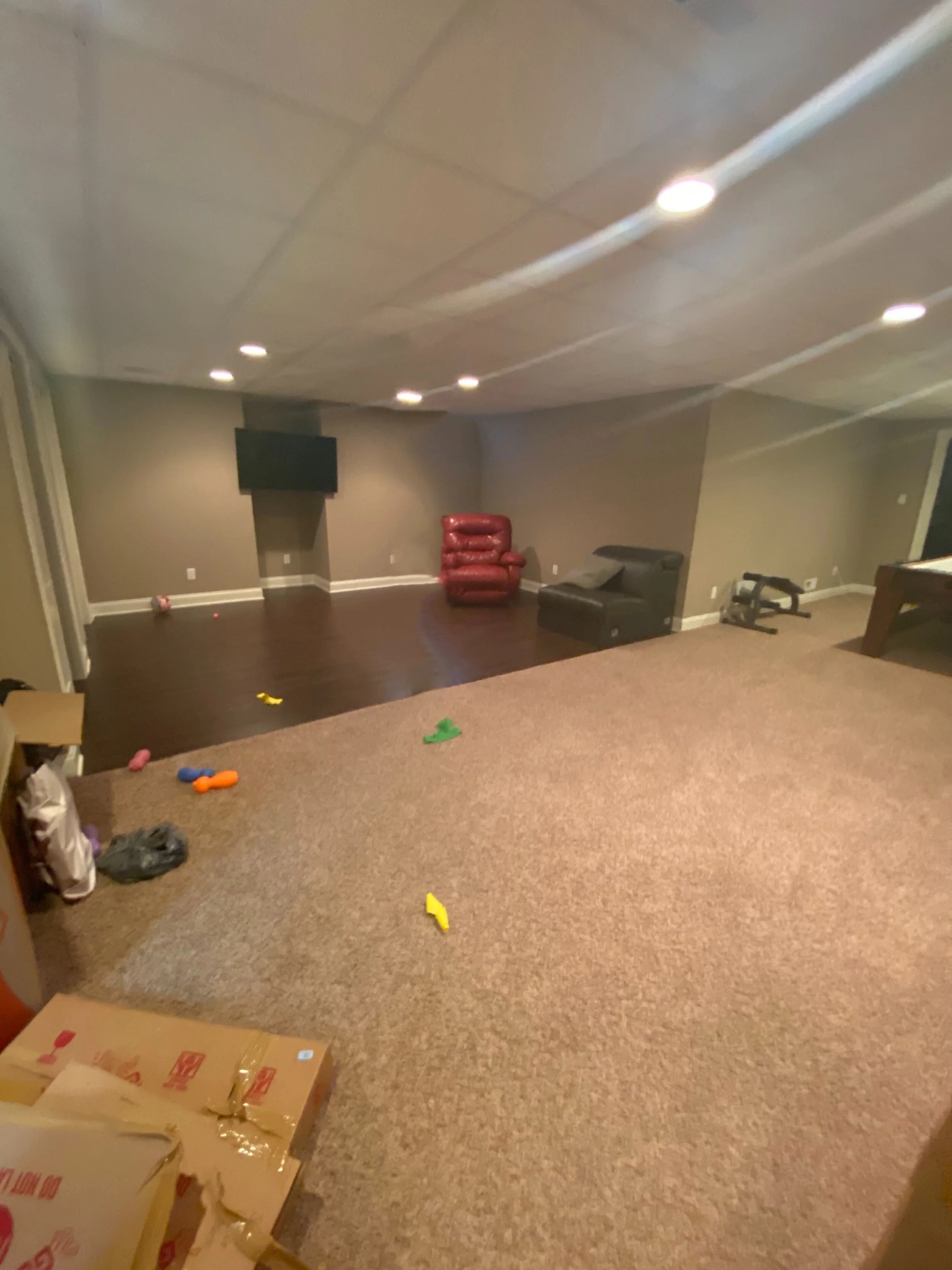
If you recall, this challenge is loosely based on a current client and a real room, so here’s a picture of the space today.
During the Virtualson’s consultation, there were many what I like to call… “design clues” shared. “Design clues” are nuggets that clients share unknowingly during our discussions, that I store in my design brain to incorporate later. One of the “clues” shared was around color. The couple shared that their wedding colors were white, black and red… Noted! I also learned that David now works from home about 50% of the time because of the pandemic, and would like to incorporate a small workstation in this new space. Lastly, I learned that Nicole had a girl’s trip planned for this year with three close friends, to one of the world’s top wineries, Delaire Graff Estate in South Africa, for a best friend’s 50th birthday. A once in a lifetime trip this year that has since been cancelled because of the pandemic. This is where the design light bulb went off and I thought to myself… how can I create a similar experience in their home. Here’s a picture from the breathtaking Delaire Graff Winery and Estate…. AH-MAZ-ING!
I’M INSPIRED!
https://www.delaire.co.za/stay/
Let’s fast forward a week or so. The Virtualsons have reviewed and have agreed to our design proposal, including design fees and furniture budget, and are ready to get started!
THE FLOOR PLAN:
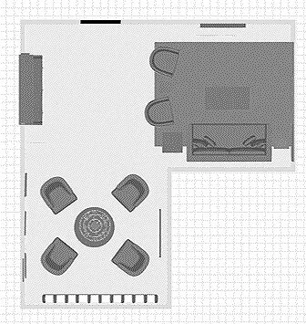
Our team typically begins the design process with a floor plan. A floor plan helps to identify flow, function, furniture specs, design direction and more. During our consultation, Nicole, David and I coined this entertaining space, their Community Room. So here's a look at the floor plans for the Virtualson’s “Community Room”. As you can see, this space will be multi-functional. There’s a zone for lounging and television watching with the kids or with friends. A wet bar for easy entertaining food prep (eliminates the need to go upstairs to the main kitchen). Furthermore, within the wet bar there’s a hidden workstation for David to use during the day when he’s working from home and lastly, there’s a sipping room… complete with a wine cellar. We’re bringing Delaire Graff Estates to Nicole and three of her closest friends, right here in New Jersey!
I am thrilled to curate a design plan that will transform this space from a “basement” into a dream “community room” . An entertaining space that is intentional, creative and reflects our client’s lifestyle. The transformation will be epic and I am excited to take you along with me for the ride over the next few weeks!
Be sure to follow along with all of the other designers participating in the challenge using the links below!
Albie Knows | Ana Claudia Design | At Home With Joseph | Barbour Spangle Design | Dwell by Cheryl
Eneia White Interiors | Gray Space Interiors | Haneen's Haven | Hommeboys | Interiors by Design
Jana Donohoe Designs | Laura Hodges Studio | Lauren Nicole Designs | Nicole White Designs | Nikole Starr Interiors
Nile Johnson Interior Design | Prudence Home + Design | Thou Swell | Traders Haven Design | Whitney J Decor | HPMKT


